

Branding That Feels Better
{01.ALPHA}
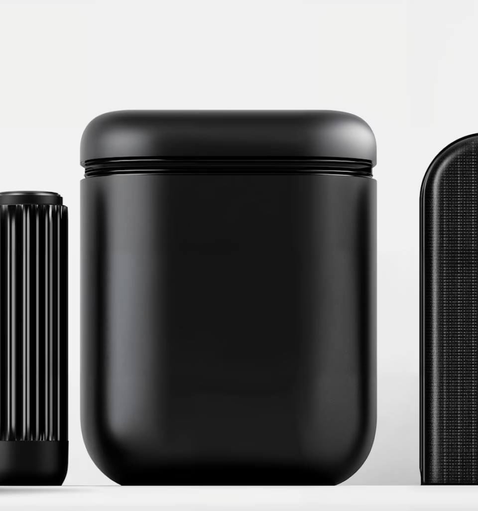
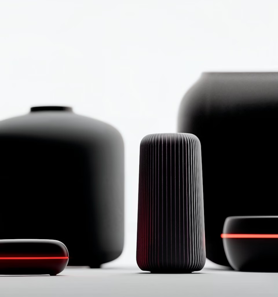
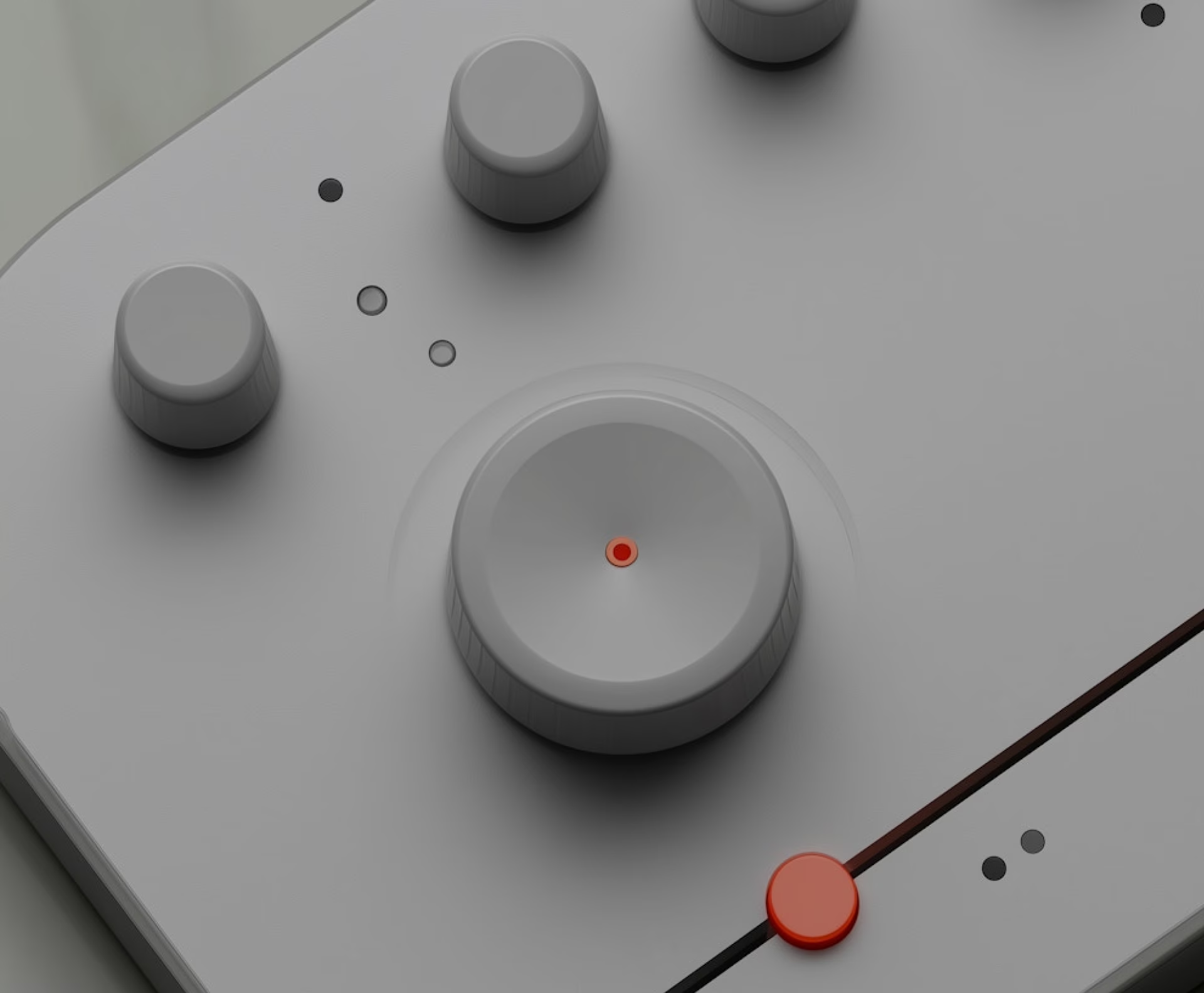
We started by reworking the brand identity: building a calm, confident wordmark; softening the visual tone through warm neutrals and rounded type; and creating a flexible system for applications across print and digital.
The website was designed to be clean, informative, and easy to navigate — especially for first-time patients. Key information like services, clinic locations, and booking options are always one click away, supported by gentle motion and subtle interactions that build trust.

Outcome
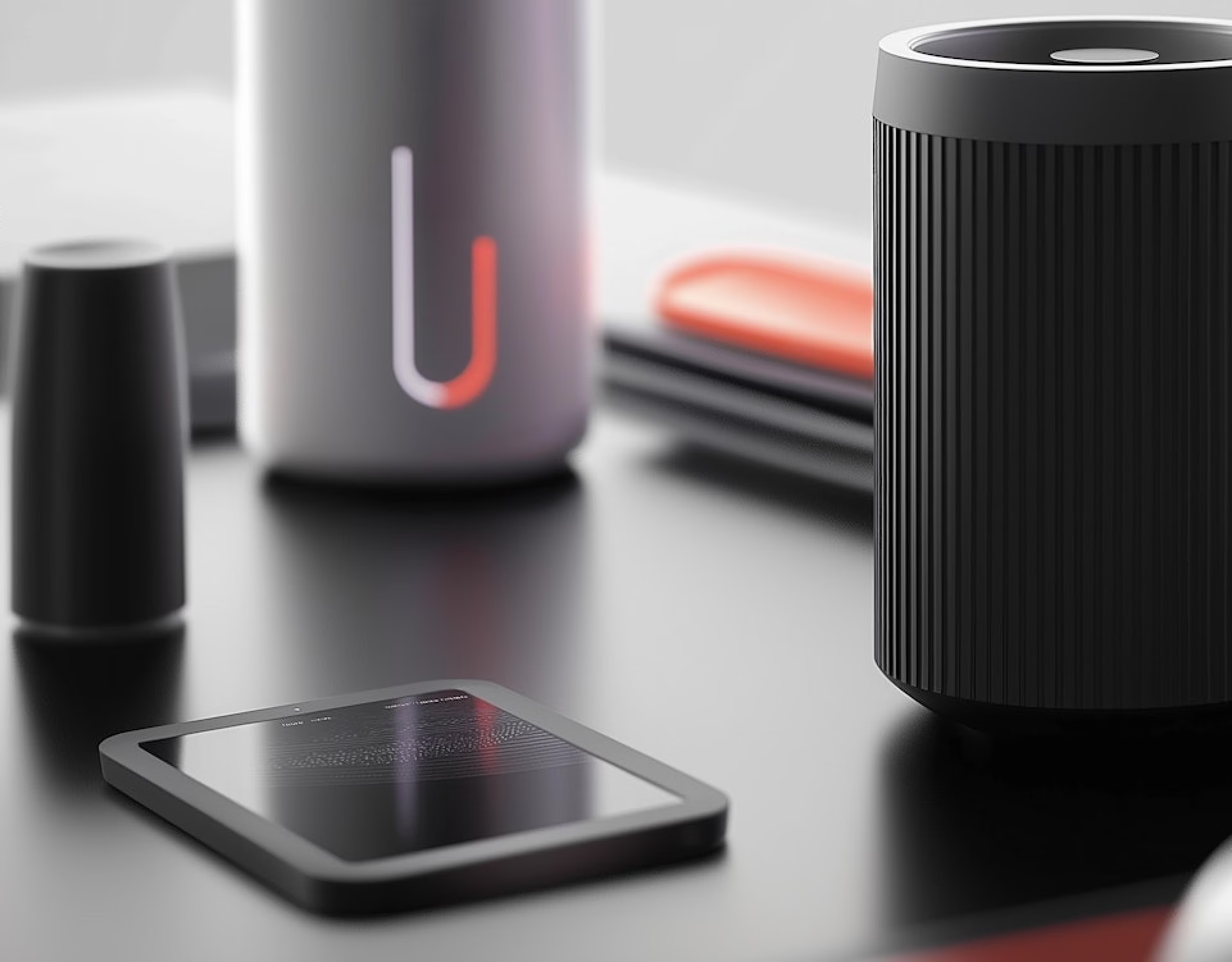
The result is a brand that feels human-first without sacrificing clarity. Nova Health now stands apart in a space that’s often cold and overcrowded — offering an experience that feels calm, credible, and easy to trust.